Infographics
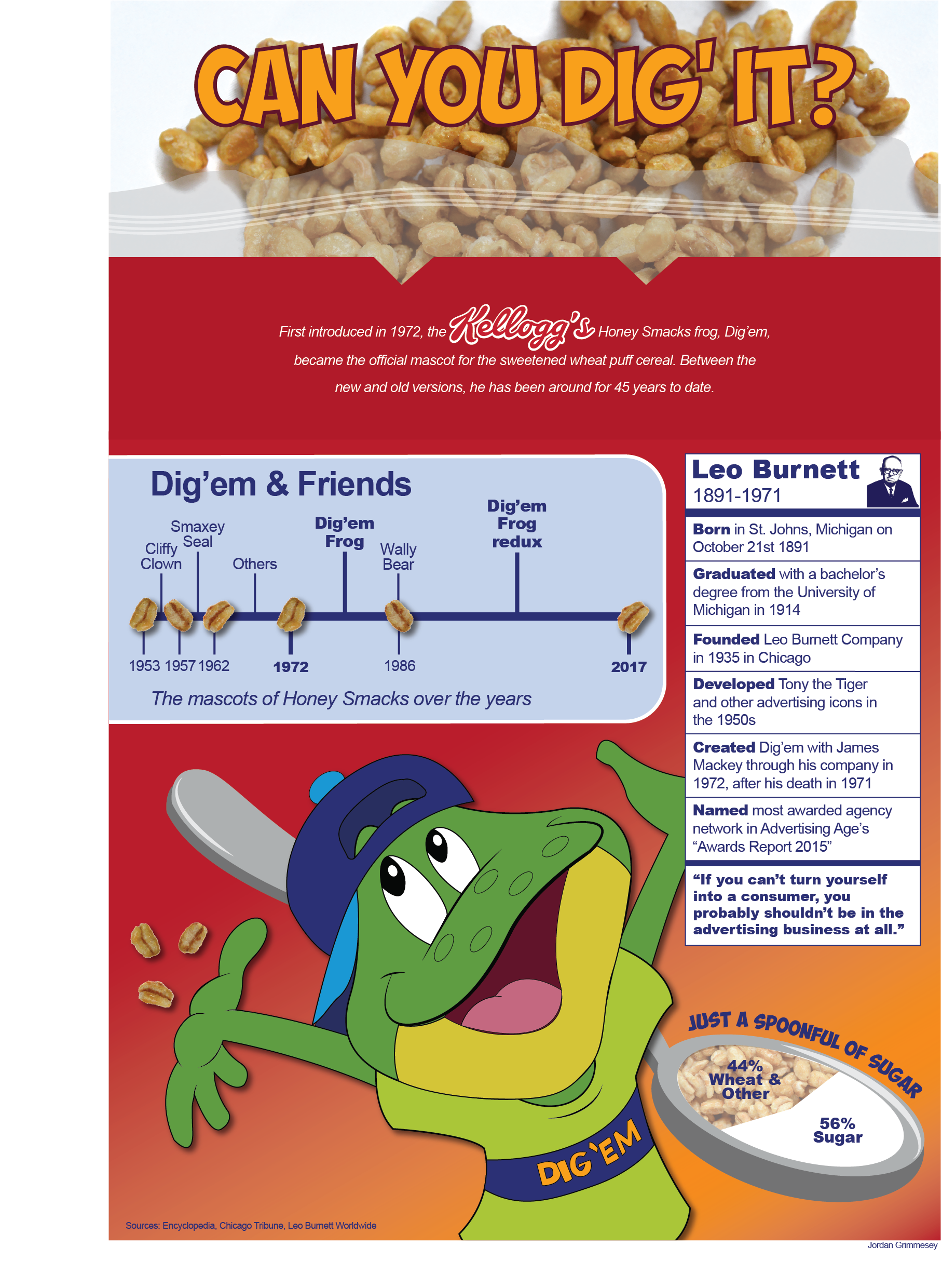
Dig'em & Honey Smacks
Informational graphic about Honey Smacks, their product, Dig’em Frog, Leo Burnett, and anything else surrounding the brand. It felt essential to capture the feel of the classic cereal box in this design incorporating photography of the product.
Created Fall 2017
Running InfogRaphic
Informational graphic about running and races. I am not a runner, but used the facts to create a fairly simple version of the information with some illustrative graphic elements.
Created Fall 2017
Identity
Frank Lloyd Wright stationary
Stationary set inspired by the architect, Frank Lloyd Wright. I chose to create a logotype that imitates Wright's buildings. I incorporated lines to mimic architecture sketches and included geometric shapes from his work.
Created Spring 2018
Farmers together logo
A logo created during the National Student Advertising Competition to increase Ocean Spray’s philanthropic footprint, connect to the target’s desire for a brand with purpose, and to remain true to the value of sustainability and importance of being grower-owned.
The Farmers Together initiative would provide support to all American farmers and their families in times of hardship. Ocean Spray is able to provide genuine assistance beyond just monetary support to help families get back on their feet.
Created Spring 2018
Student Success center work
Branding created for a conference developed by the Student Success Center at the University of South Carolina. I created these along with many other publications for the SSC office during my time as their marketing intern.
Created Spring 2019
Logo redesign
Redesigned logo for a local day facility for adults with special needs. Additionally created a business card and bus wrap. I chose Hope Bridge for this project after falling in love with what they do while volunteering with them one day. The old logo did not exhibit Hope Bridge's light-hearted, yet professional services. I used the sunflower instead of their previous simple sunshine to really show the growth that can happen in individuals through their services.
Created Spring 2017
Layouts & Publications
InterCom
Alumni
Magazine
Table of contents created for the University of South Carolina’s College of Information and Communications’ magazine for Alumni.
Created Fall 2018
omega phi
alpha times
Magazine created for Omega Phi Alpha Service Sorority at the University of South Carolina. Includes stories and photos submitted by members of the organization about advocating for passions in an effective way. The goal was to connect the UofSC campus together and get information to other students about many organizations on campus.
Created Spring 2019
Photo
Essay
Photo essay about the Office of Multicultural Student Affairs' annual Diversity Retreat. I shot the pictures, interviewed subjects, designed the layout, and wrote the copy and captions. This event is an incredible, weekend-long retreat that fosters community and conversation among students that may never have otherwise met.
Created Spring 2017
Portrait
Illustration
/ Magazine
cover
Magazine cover using an illustration of a classmate. When looking at illustrative portraits, lots of them included people looking at the camera, smiling. I wanted to do something different, so I made my classmate pose in new ways until we landed on this shot. I then created this illustration using Adobe Illustrator to resemble the photograph.
Created Spring 2017
VIDEO & animation
NPHC MINI-Doc
When given the assignment to create a mini documentary, I knew that I needed to focus on an underrepresented community on my college campus. In my involvement with the Office of Multicultural Student Affairs, I have worked with and become friends with many people that are a part of the National Panhellenic Council community. I also see others who have no idea that these organizations exist on our campus, so I decided to provide the platform.
Created Fall 2018
TYPOGRAPHY & Illustration
Atlanta typography screenprint
I combined my design and screen print knowledge to develop this Atlanta graphic tee. I digitally created the typography and screen printed it onto t-shirts, pillows and posters. Growing up in Atlanta shaped me into the person that I am today, so I decided to showcase it using my craft.
Created Fall 2018
Screen print
I added a screen printing class to my schedule in the fall, and I had no idea what I was in for. This piece was designed around the concept of “Trace”. I created a five layer design that showcased my connection to my family that was in the Japanese American internment camps. The used my grandfather’s sister’s quotes to highlight the hardships that they faced as they examined their identities of both Japanese and American when both turned against them.
Created Fall 2018
Bee Illustration
Bee illustration created for the InterCom. This magazine is distributed to the alumni of the University of South Carolina’s College of Information and Communications.
Created Fall 2018
Atlanta Playing Cards
Playing cards based on a person, place, or theme. I, of course, chose my favorite city. This was one of my early design pieces that I still love. I could update them, but I just don't have the heart to change anything.
Created Spring 2016
Postage Stamps
Kitchen themed postage stamps. I used the pale, classic colors to convey creation in the daily household location.
Created Fall 2017
Found object quote
Typographic quote using found objects. I created this with objects found at a hardware store. I arranged all of the pieces on wood and then photographed it.
Created Spring 2018
Diversity & Inclusion Poster
Poster about the hidden meanings behind the words diversity and inclusion. The two words are often tied, but are not interchangeable. It is easy to have a room full of diverse individuals without including everyone in the conversation.
Created Fall 2017


